I’ve experimented with making longbows with four different riser layouts. Riser A represents probably the…
Applying the designer’s “rule of thirds” to tip design
Anyone can glue on some tip overlays and shape them into a suitable bow limb tip, but do they look good? As a graphic designer, I’m always interested in making my bows look good and have good proportions. This applies especially to the limb tips.
The designer’s “rule of thirds” goes something like this…a photo, painting, or design usually looks better when you put the focal point one third of the way from the edge than putting it in the center. The following quote from Wikipedia explains it like this…
The rule of thirds is a “rule of thumb” or guideline which applies to the process of composing visual images such as paintings, photographs, and designs. The guideline proposes that an image should be imagined as divided into nine equal parts by two equally-spaced horizontal lines and two equally-spaced vertical lines, and that important compositional elements should be placed along these lines or their intersections. Proponents of the technique claim that aligning a subject with these points creates more tension, energy and interest in the composition than simply centering the subject would. (From Wikipedia. Click here to see the entire explanation.)
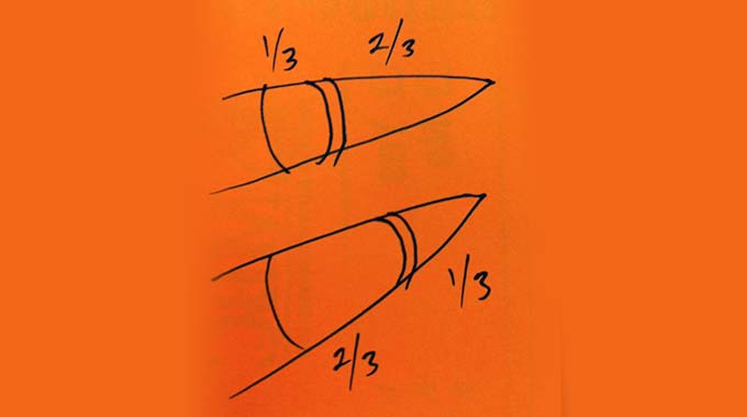
For bow limb tips, the focal point is usually where the string groove is located. It looks best when it is placed either one third of the way from the tip to the end of the overlay…or from the other direction…one third of the way from the end of the overlay to the tip. The photo illustrates this (click on the orange photo to see it larger).
The upper drawing looks great on long, narrow bows like English longbows. The long, sleek lines help the design flow from end to end on this style of bow. Making a built-in tip on an ELB really long and thin also makes it look more like the bone or antler tips that are often glued onto the tips of English Long Bows.
A tip designed like the lower drawing often looks better on short, wide tips like recurves and flat bows. The short, squatty design accentuates the short lines of a short and wide bow. This style of tip is probably stronger than a tip that looks like the upper drawing, too, because it reinforces the area below the string grooves more. Making the overlays long, gradual, and tapered helps distribute the stress from the string over a larger area of the limb tip. Plus, minimizing the amount of material beyond the groove reduces moving mass which improves bow efficiency. It is likely that any material that is left on the tip when making your bow does not add much additional strength, and merely adds more moving mass. A fast, efficient limb is like a hot rod drag racing car…the lighter it is, the faster it will recover from full draw to brace height.
I hope this idea helps you decide what tip design(s) you like best.
Please share this with your friends and feel free to make a comment below.
Related Posts
Is this the poor man's golden ratio? http://en.wikipedia.org/wiki/Golden_ratio
I cannot see the article. The title is interesting…..
Oscar Adolfo Martinez not sure where you saw my comment, – try to access the article directly under – http://localhost/byob_update/applying-the-designers-rule-of-thirds-to-tip-design/?fb_comment_id=fbc_10151895218250054_10154325038110054_10154325038110054#f2fabfe6b4
Jean-Luc Streff Right now I can see the article! Thank you!
I was not even aware my comment was published at FB. I was replying at Jim's Blog.
I was not even aware my comment was published at FB. I was replying at Jim's Blog.