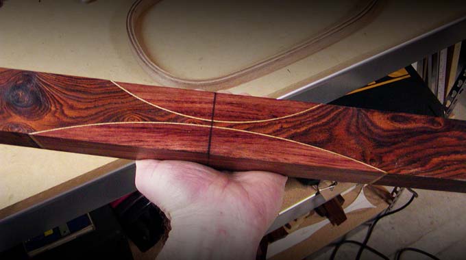
I’ve experimented with making longbows with four different riser layouts. Riser A represents probably the…
Contrast is good when making bows!
I have to admit that I am an artist first and a bowyer second. Yes, making bows is an opportunity to unleash my inner mad scientist, but it is also a chance to express my artistic ability. Whenever anyone asks me what I do, these days I just say “I am an artist” or “I am a designer.” Most people understand what that means. I’m wired as an artist and so I see the world through an artist’s eye, always searching for beauty, unity, and an attractive and satisfying solution.
I think everyone knows at least one artist…that eccentric aunt or uncle who paints, has a kid that excels with crafts, or maybe even you like to dabble in photography, drawing, or graphic design. I often joke that everyone thinks they can do graphic design, photography, and construction. All they need are some tools and the day off. While this is certainly true to a great extent—most people are naturally gifted at creating something—it also seems obvious to me that the best artists and builders have a natural proficiency for it. It is a God-given talent that makes it easy for them to excel at it. And, some of them are just crazy. You know the type.
Well, anyway…the point I am trying to make is that artists are wired differently and see the world differently than “normal” people. So, I admit that I’m an artist, I’m wired differently, and I also see bows differently than many people. Twenty-seven years of making bows and looking critically at them has proven to me that I see a bow as a work of art as much as it is a functional tool. Yes, form follows function, and functionality is foremost, but beauty and esthetics are important, too.
“So what is your point?” you might ask. Okay, the point I am getting to is that contrast is good when picking out the riser and accent woods for your next bow. There are lots of good bow making woods available, so you might as well pick some that look good together. Picking woods that contrast with each other make the best looking bows.
Four ways to create contrast
The best looking bows have stripes, footings, overlays, and/or wedges that contrast with the rest of the bow. Good contrast is created when we make wise choices of color, value, pattern, and texture, by choosing woods that differ in one or more of these categories instead of putting woods next to each other that look too much alike.
1. Color
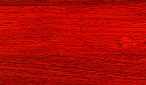
Color is the hue of wood…orange, yellow, red, brown, etc. I think it looks best to combine wood colors that compliment each other like yellow and brown, yellow and black, red and brown, etc. You know, colors that look good together and don’t clash. Picking good color combinations is kind of like picking out clothes, so if you struggle with this, maybe the next time you are picking out woods you should go ask your wife…lol?
A good example is putting osage (yellow) and cocobolo (reddish orange) together. On the other hand, combining woods of similar color often looks bad. It is hard to make some similar colors look good together. When they are close to the same color but just slightly different, the combination can look very bad. When picking out woods for bows, I think it is best to err on the safe side and choose colors that are more different, even more different than you might expect. This way the finished bow will turn out looking good.
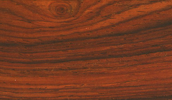
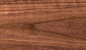
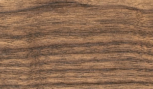
Left to right: cocobolo (reddish orange), osage (yellow), padauk (red), walnut (rich brown)
2. Value
Value means how light or how dark the wood looks. Combining a light wood (maple, osage, bamboo, etc.) and a dark wood (walnut, cocobolo, rosewood, ebony, etc.) is the easiest way to create good contrast. Choosing all dark woods or all light woods usually looks bad. Well, it doesn’t always look bad, but at the very least it is hard to tell the difference between the woods. Contrast is created with there is enough difference to tell where one wood ends and the other begins.
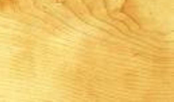

Left to right: osage (light), maple (light), walnut (dark), ebony (really dark!).
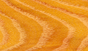
3. Pattern
For wood, pattern is probably best defined as the way the wood grain looks. I like to combine a wood with a vivid grain pattern like bocote, kingwood, leopardwood, or zebrawood next to a wood without much or any visible pattern like ebony, walnut, plain maple, or osage. Some woods have a really distinct and unique pattern like birdseye maple, quilted maple, and leopardwood. Good contrast is created when a patterned wood is placed next to a solid wood. If you want to make a mess, try putting two distinctly patterned woods right next to each other (just look at the patterns all lined up below). This is just ugly most of the time. Again, like picking out clothes, it is like wearing stripes and plaids in the same outfit. Your wife would NOT approve.
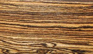
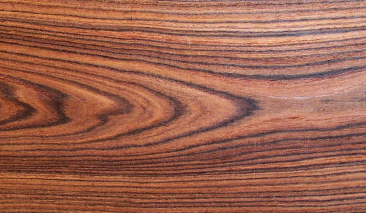
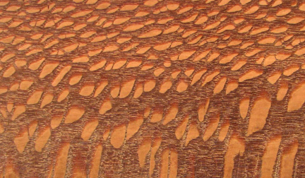
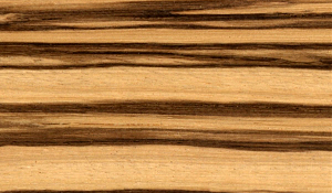
Left to right: bocote, kingwood, leopardwood, zebrawood.
4. Texture
Texture describes the appearance of the surface of the wood. The best example of a textured wood that I can think of is palm or walnut that have deep looking pores. It looks best to put a textured wood next to a smooth wood. Also to be considered is the man-made texture that is created on the surface of a bow like checkering or stippling. Good contrast is created when textured wood is placed next to smooth wood.
I guess everyone has different tastes when it comes to designing bows. Some people like all darks, creating a subtle amount of contrast and a stealthy, tactical, ninja look. Others like combining defined patterns in the attempt to create camo. I just think that the best looking bows have plenty of contrast between the colors, values, patterns, and textures. Hopefully, considering these different characteristics will be helpful when choosing woods for your next bow…and you won’t have to ask your wife.
Related Posts
HI JTHORNE
This is Hass. I haven’t been receiving your emails could you please resend
I sent an email to your hassnbow@outlook.com email address.
Are you on Facebook? If so, then we can message there.
https://www.facebook.com/BuildYourOwnBow
Hi Jim Thorne
I’ve been messaging you on Facebook, could you please reply
Hey Hass,
I sent you a reply via email. Were you able to see it?
Jim